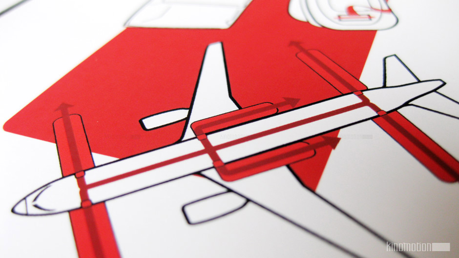

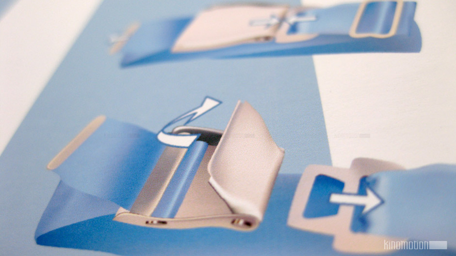
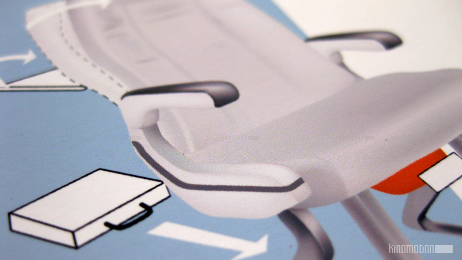
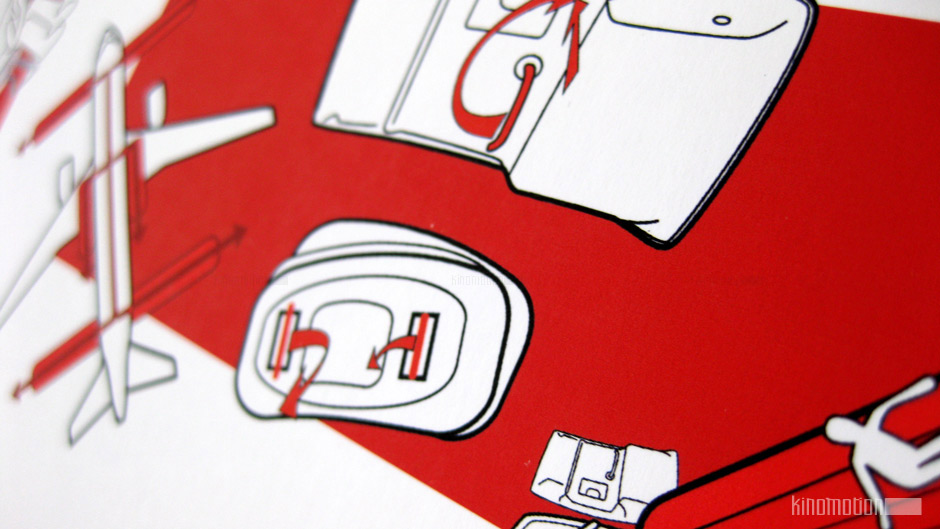
Aircraft safety cards are usually documents that people don’t pay a lot of attention to, but nevertheless very important for the safety of all passengers on board. Many of them never bother to read it unless they really need, and that’s exactly the time when the clutter of information mixed with panic is going to be a problem the already very limited attention span of the passengers in an emergency situation.
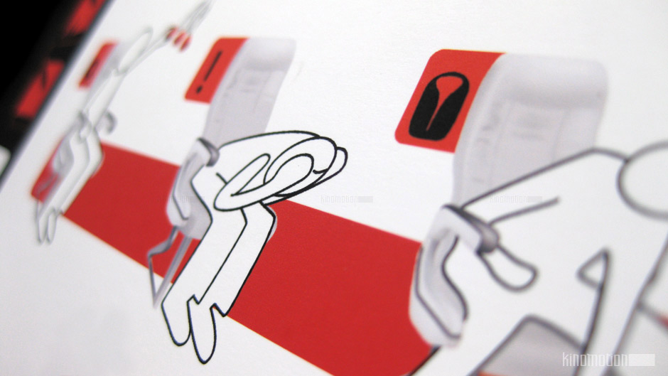
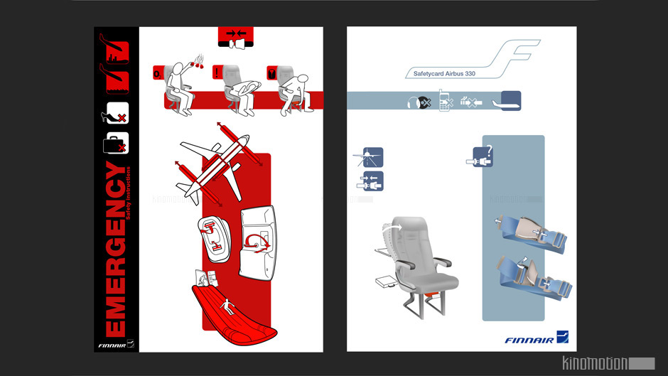
In this proposition I divided the fundamental information that’s necessary in an emergency in one page using bright colors and a lot of contrast, and the less fundamental info in the second page, with a calmer palette. It’s a minimalistic approach that re-thinks how safety cards are projected, and distributes information to be accessed only when it’s needed.