Most of the so-called “green logos” share the same clichés: they have leafs and they are green coloured.
We can see this phenomenon everywhere, and it looks more like a marketing strategy than real environmental attitude. The big idea with “green” branding and design is to pass on the message that the business is sustainable and environmentally friendly. But what are the reasons why “green” became cool?

Consumers are nowadays bombarded by an endless stream of news about global warming and worries about energy taxes and regulations. For these and other reasons by buying “green” consumers face an easier choice and companies reduce friction at the time of sale. Not only companies can sell easier, they can sell for more if they are “green”. Its ethical consumption allied with a premium price that can be put on green products to that justify it with increased production costs that no one cares to check. That practice is commonly called greenwashing, and has been done over and over sometimes simply by printing in recycled paper, replacing office lamps by eco-bulbs, or in some cases just by changing their visual identity and branding.

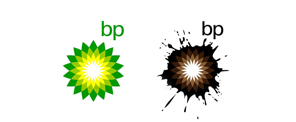
But branding is much more than visual identity and design. If a business is greenwashed, consumers will over time figure it out and stop believing on its promises. Think about all the energy companies that go to extremes to show windmills and how green they are on their posters, while they are among the most energy consumption businesses. BP spent about 200 million dollars on re branding their company, but unfortunately got their reputation stained to a point beyond repair in the 2010 Gulf of Mexico oil spill. No amount of good design or branding efforts will save a business from broken promises. Not only this incident damaged BP, but also every other company claiming “green” got hurt by extension. The more “green” companies we see, the less credible will be their promise as we tend to extrapolate the bad practices of some to all the others too. On purely visual grounds the overuse of “green” design features will diminish in effectiveness over time. The more green leafs we see in logos, the less we’ll care about them and the harder it will become to differentiate them from other businesses. The key in branding and design is differentiation, and once the market is over saturated by “green”, other promises and visual cues will be dominant to take place.
Another trick for business looking to be green is co-branding. Think about energy star , fair trade or any of the 433 (as of July 2012) tracked on the ecolabel index. It’s an interesting exercise to see how many of them have leaves in that list. And like green leafs there are other usual cliché’s being overused in allegedly eco-friendly companies and products like the use of stencil or hand drawn typefaces, brown and earth colours, grainy textures.. The list goes on and on. Interestingly enough not only one of the 25 Greener global companies have leaves in their logos, and most are not green in color. This proves that it is company behaviour and not its visual identity that is the main brand driver. Read more: Dying leaves, by Emblematic Green Branding: Why Originality Matters IMD – EPFL study finds eco-labels “overwhelming” for firms and customers Greenwashing “Got green?” and 10 other brand-curdling clichés to avoid in your green marketing
