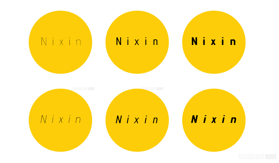
If you are looking to buy the typeface, please visit our SHOP and subscribe above.
I just finished a kickstarter campaign for this typeface, so and I’m still organizing a few things for the delivery.
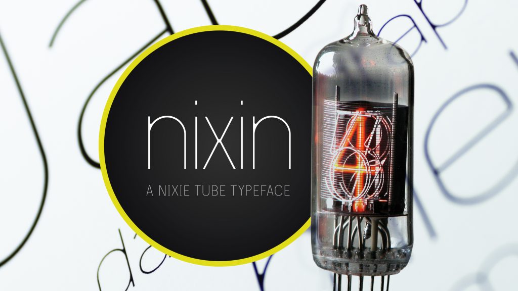
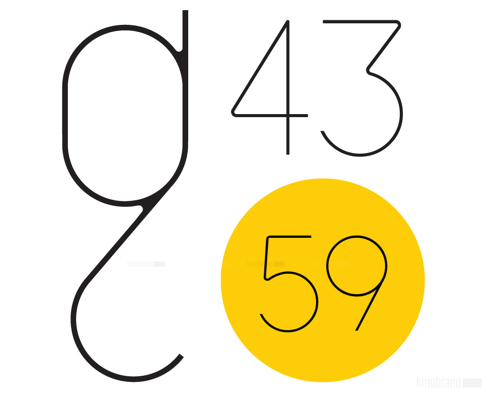
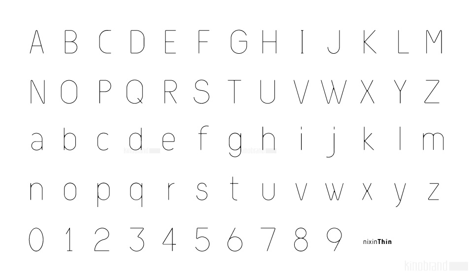
A nixie tube is a technology from the 50’s used to display numerals that are composed by metal filaments that light up much like a lamp bulb. Due to their beauty these little numerals (0-9) are a love case for any designer, and formally it’s where the inspiration for the Nixin typeface came from.
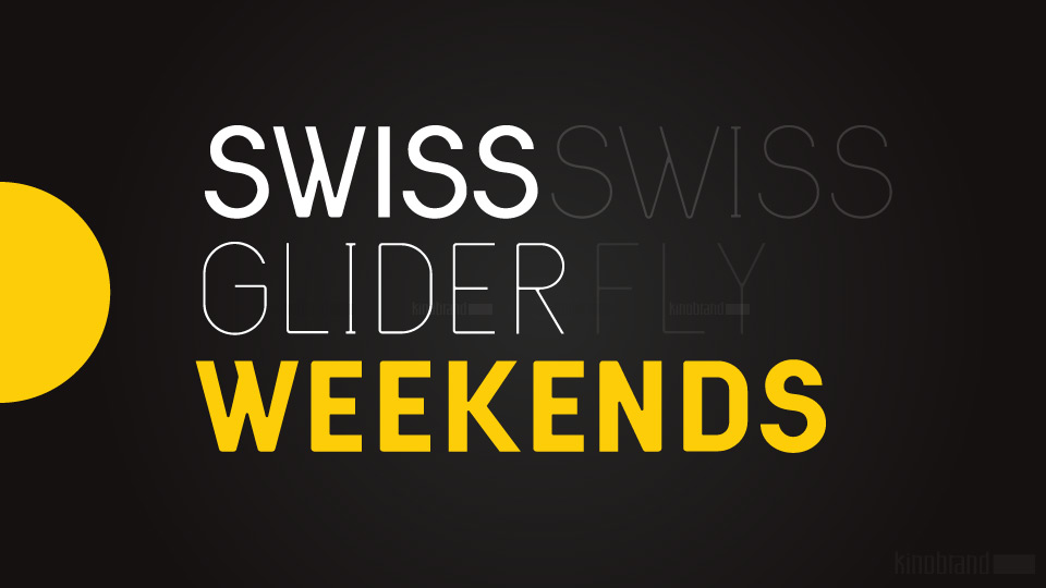
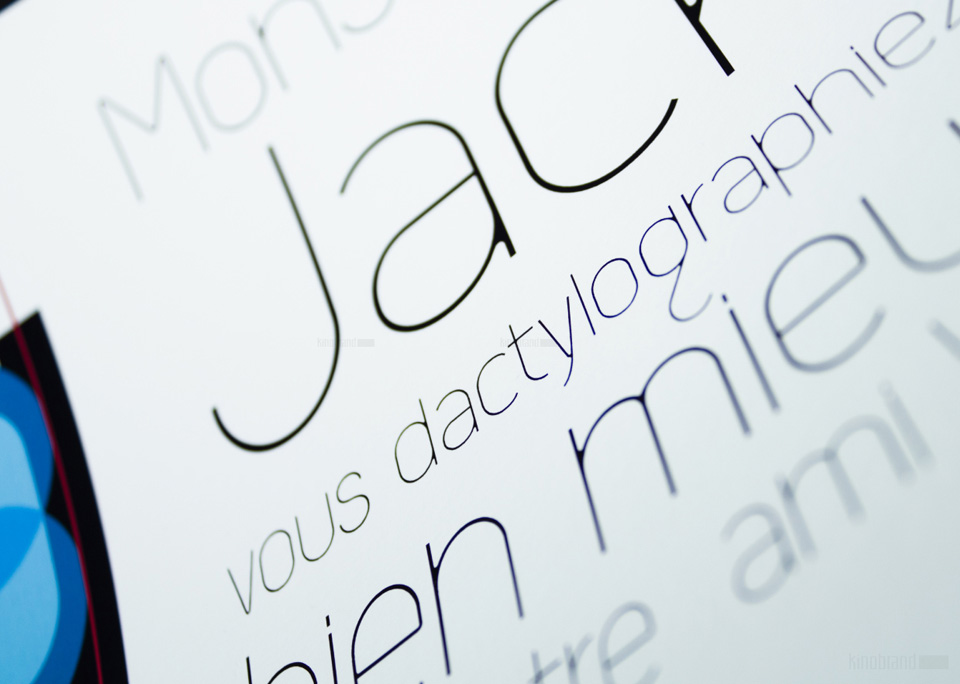
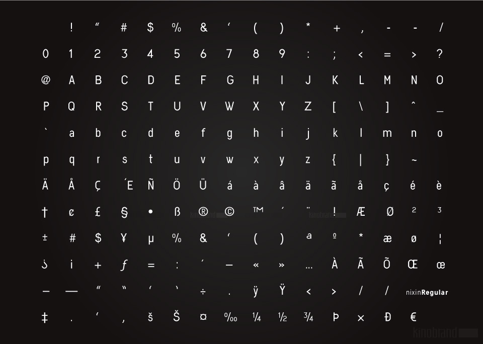
All the other typeface characters and weights (Extra Light/Normal/bold) are an interpretation from the original 10 numerals, always keeping the same minimalistic spirit and formal elegance. Nixin is a geometric and regular typeface, with a vintage touch and a bit of modernism.
Though evenness is the driven philosophy for Nixin, “typefaces are not soldiers in an army”(*Erik Spiekermann), and its the subtle variations that keep different characters interesting and give Nixin a strong personality.
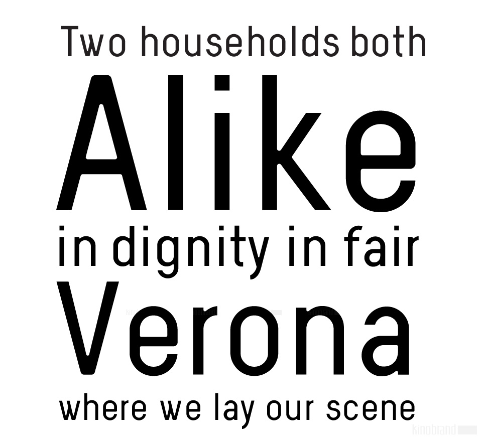
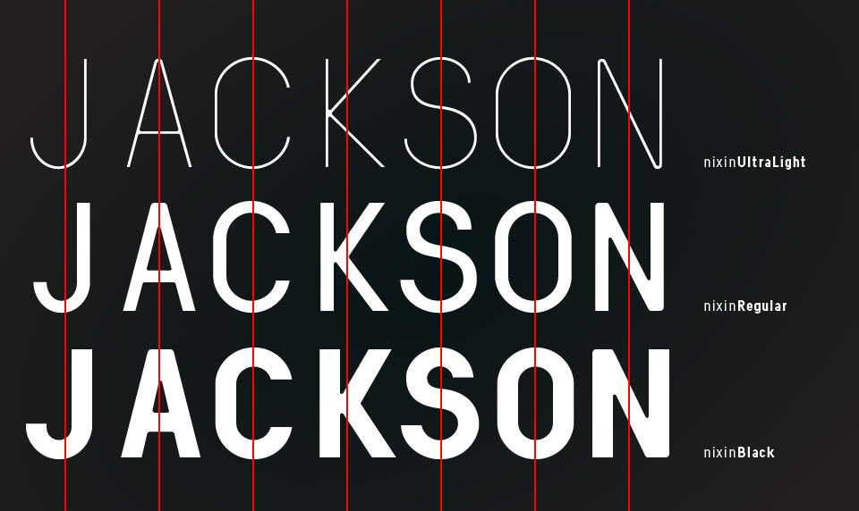
Being a geometric sans and due to its characteristics this typeface is highly legible in small sizes, but it stands particularly well as a display typeface where we can appreciate its details and construction, in particular the brackets and corners that always have the same curvature, regardless of the weight.
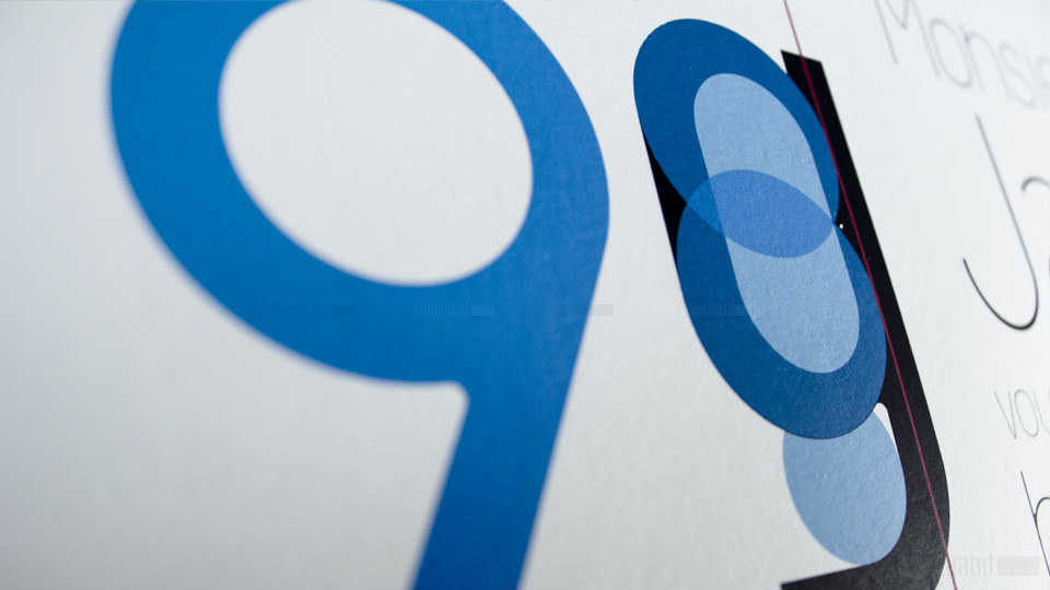
Nixin is minimalist and is based on two fundamental shapes: the circle and the rectangle that determine its behaviour in multiple variations.
